
Sprout


Sprout is an app that provides personalized mental healthcare resources tailored to the needs of our diverse youth, aged 13-19.
Overview
I was afforded the opportunity to collaborate with two other UX designers to design an app centered around providing mental health support for individuals aged 13-19 while incorporating the use of a virtual companion.
This project was part of a designathon that took place remotely, over the course of around 3 days from user research to final prototype.
My Role
Tools
Figma, Miro, Pen and Paper
Timeline
April 2024 (< 3 days)
Research
Since this was an accelerated design challenge, my team understood that we only had a few hours to gather research before we could begin crafting ideas and designing.
Due to time constraints, we were unable to conduct any user interviews.
Through secondary research, we learned:
1 in 7 10-19 year-olds experience mental health conditions, yet remain largely unrecognized and untreated. This number doubles for marginalized groups - BIPOC, LGBTQIA+.
Products tailored to these age groups are limited, mainly due to lack of an empathy-driven approach in existing applications.
Considerations for inclusiveness, engagement, and accessibility are often an afterthought.
We decided that we would meet our users where they’re at - their phones.
We utilized Miro for the entirety of the project to capture our findings.

There are so many apps out there for mental health!

Not all mental health apps are created equally.
Brainstorming
Once we had gathered research from other apps, we came up with 3 How Might We’s to shape our design process.
How might we utilize customization to tailor the app to youth?
How might we empower youth to navigate and manage their mental health better?
How might we ensure our app is both captivating and inspiring for young users?
Who will our App Help?


Understanding User Expectations
After digging into news articles and published journals, we determined we would implement three features that would address the following user problems:
Personalization
As a youth, I want to have control over my app’s aesthetics, accessibility, notifications, and check-in settings, so that the app is personalized to my wants and needs.
“[I’d like] customizability to make it fit for you and not just a broad spectrum of things.”

Customization
Onboarding asks the essential questions that customize the app experience to a youth’s needs with diverse backgrounds.
Emotion Management
As a youth, I want to have a way to track my moods, so I can understand my feelings better.
“Adolescence is a crucial period for developing social and emotional habits important for mental well-being...These include...learning to manage emotions.”

Check-In
By providing check ins, we can capture data that can help youths build their emotional self awareness.
Interactivity
As a youth, I want to have a fun way to interact with the app, so that I have an engaging and motivating way to learn about social emotional topics.
“...In order for youth to want to use a wellness app, they would have to bring in entertainment...including games, like something to make it more fun.”

Gamification
Providing mini-games like the garden of moods provides youths with positive reinforcement for building better mental health habits.
Exploration, Ideation, and Collaboration
Once we had determined the three areas to focus on, we each began ideating beginning with a Crazy8s exercise for our two key features.
Onboarding
Gamification
Below are my sketches for the onboarding and gamification features we wanted to implement. I can’t show my teammates’ drawings but there’s something exhilarating about conducting a remote Crazy8s exercise with a team of 3!
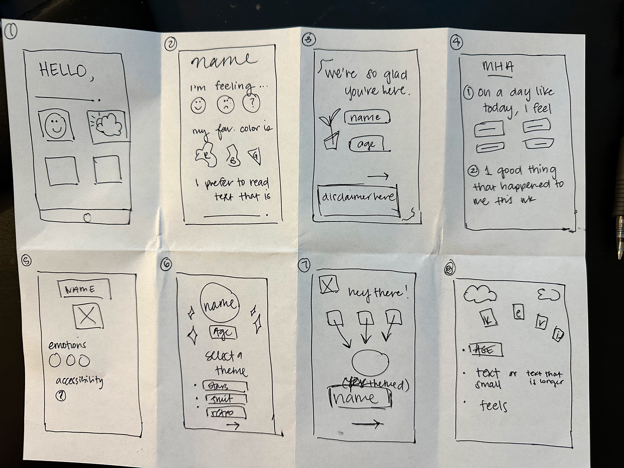

In previous projects, I had completed these on my own, so it was inspiring to work with my team and see so many ideas come together in such a short time period!
My screens were centered around calming, relaxing mini-games while prioritizing customization.
Designing
Following our Crazy8s exercise, together we determined which screens and features best captured our vision for our app.
With the interest of time, we decided to prioritize mid-fidelity to high-fidelity screens.
Below are just a few examples of our onboarding screens. We wanted to incorporate a y2k theme and give the app some character by using hand-drawn elements. We tapped into our own childhoods bringing in elements such as holographic patterns, pastels, and lots of textures.


Features
Onboarding:
selecting a relevant age group
goal-setting
check-in preferences
meeting our AI companion, Bling Bot
a tutorial
homepage personalization


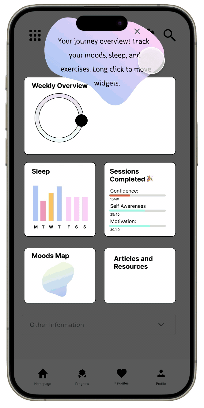
Check-In:
can validate whatever mood or emotion you’re feeling
tracking moods allow for self-awareness
youths with more self-awareness can better identify emotional patterns and trends

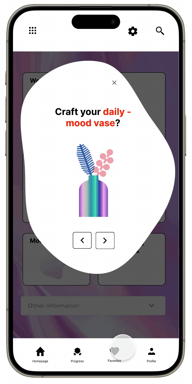
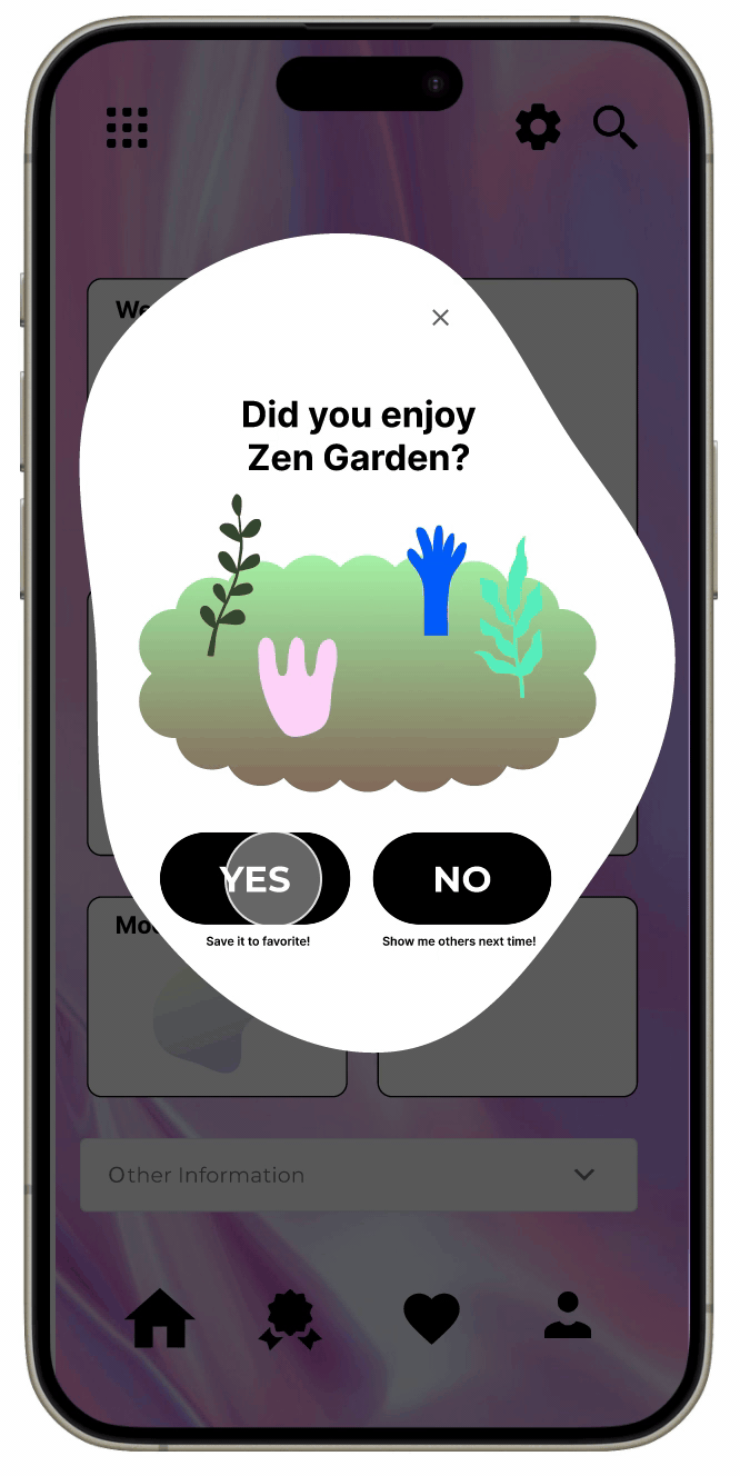
Gamification:
calming games such as building your own bouquet with a daily mood vase
come to relax at the zen garden by planting flowers that represent your mood
positive reinforcement to improve mental health
Next Steps
01.
I would modify each page to include an accessibility icon and include this feature in our settings.
02.
To ensure that our product is not infallible to bias, I would do a deeper dive into the relationship between AI and biases of the creators of this revolutionary concept.
03.
I would like to explore other ways we can make our product user-friendly to users outside of our target group, namely the neurodivergent population living with ADHD, ASD, and Asperger’s.
Reflections
This was the first project I was given the opportunity to work on within a team setting, and my very first designathon project. After three rigorous days of designing a product from end-to-end, I learned how to lean on my teammates and collaborate in a short period of time. It was very rewarding to see all of our design ideas come together in the form of our mental health app.
As time was a large limitation, user interviews and testing were not feasible. I would have enjoyed the opportunity to have real users test our product and gather insights to improve our product.
As designers, our job is to make things as accessible and inclusive as possible. All in all, in order to create an inclusive mental health app, we must be open to keep learning about inclusivity.