
Healthy Catering for a Wedding Venue
A new mobile experience for newly engaged couples who are seeking healthier catering options for their big day.
Overview
My Role
I contributed to the overall design process and oversaw aspects related to user research, user flows, wireframes, prototyping and usability testing.
I spearheaded user interviews, synthesized our research findings into workable prototypes, and created the interaction design.
Tools
Figma, Mural, Google Slides, Adobe Acrobat
Timeline
March 2023 - September 2023
Problem
Kohaku Springs, a new wedding venue, wants to help newly engaged couples provide healthier food options for themselves and their guests.
Goal
Design a solution that streamlines the meal selection process while emphasizing healthier alternatives.
From Excitement to Overload
I remotely interviewed four users and identified a primary group through research:
Newly engaged couples, who started out excited, were beginning to feel a bit overwhelmed by all the food options for their big day. With so many choices, what was once fun was now starting to feel a little stressful.


To address user needs, I created three How Might We’s to improve the user experience.
1. Increasing Visibility
“I’d like my guests to enjoy more than just a salad. We want our guests to eat good and feel good!”
How might we make healthy food options more visible and appealing to couples planning their wedding menus?
2. Optimizing Time Spent
“There is simply not enough time in the day to do everything I want to do - like plan this wedding.”
How might we streamline the meal selection process to save couples time and reduce the complexity of planning?
3. Catering to More Than Just Food
“I have dyslexia and the amount of text on a screen ultimately determines the amount of energy I have to browse.”
How might we design an accessible platform that caters to all users, regardless of their technical skills or abilities, to ensure a seamless experience?
User Persona
In order to design for users, I created Ellie Nellie, a newly engaged Dietician who also faces daily challenges posed by dyslexia.

Journey Map

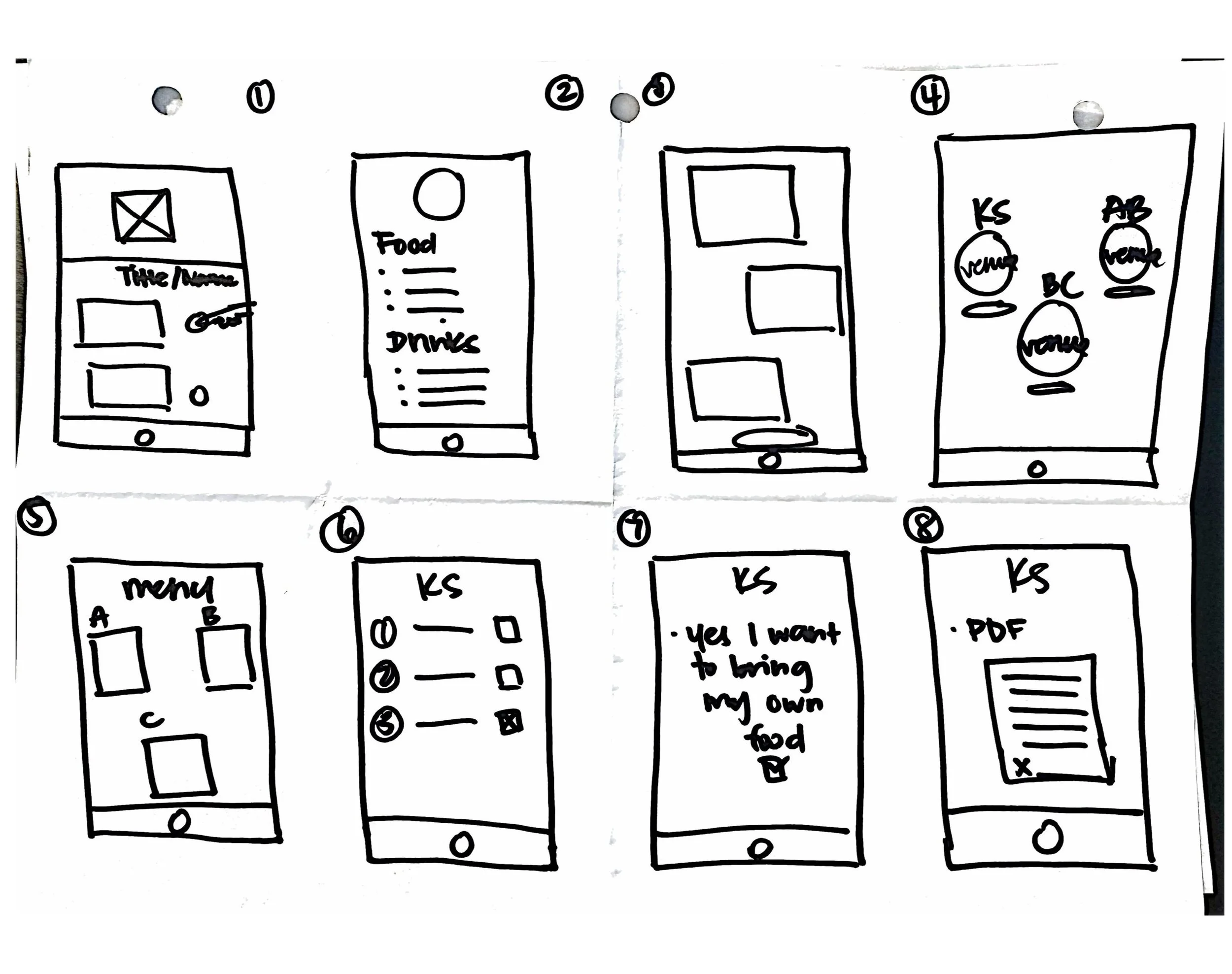
Sketching it out
It was here that I first learned how to create storyboards, big pictures, and partake in my first Crazy 8 exercise.
I loved the idea of drawing ideas out rapidly on paper, even if I felt that my ideas were far-fetched or unbelievable - the exercise was meant to be a creative one and I accepted the challenge.
User Experience Insights from Low-Fidelity Testing
After designing my low-fidelity screens in Figma, I conducted an unmoderated usability study with 5 participants to determine if there were any pain points or areas of opportunity.
Below I’ve included the high-fidelity screens that address participants’ pain points.
Pain Point #1: Unintuitive Navigation
Problem: Users don’t feel like the menu is intuitively laid out.
Improvement: Add visual cues to indicate when items are added to cart, update layout of menu page to follow an intuitive process.
Pain Point #2: Checkout Confusion
Problem: Users are confused by the checkout flow due to inconsistencies with button content and a missing “delivery address” section.
Improvement: Clearly label buttons and screens so they are consistent to reflect intuitive checkout flow and add “delivery” section.
Pain Point #3: Vendors vs. Menus
Problem: The homepage layout feels unintuitive and there seems to be no difference between “vendors” and “menus”.
Improvement: Re-design the bottom navigation bar to be more intuitive and update “Menus of the Month” to only vendor names to prevent confusion.
User Experience Insights from High-Fidelity Testing
I refined my designs based on feedback from the low-fidelity prototype, then conducted an unmoderated usability study with 5 participants for my high-fidelity prototype to confirm improvements and identify new opportunities.
I conducted a second high-fidelity usability test with the same participants to confirm functionality.
Pain Point #1: Interactivity & Navigation
Problem: Users want better visual cues for interactive elements and navigation throughout the app.
Improvement: Add visual cues to indicate which elements can be interacted with and ensure icons reflect accurate active and inactive states so users can easily navigate through the app.
Pain Point #2: Vendor Page Confusion
Problem: Users are frustrated by the current way to access the menu.
Improvement: Re-design the menu page so the menu is easily accessed in an intuitive way.
Pain Point #3: The Cart Cues Blues
Problem: Users want better visual cues when items are added to cart and want an easier way to add items to their cart.
Improvement: Use active and inactive icon states to indicate to users the status of their cart and re-design menu page to follow more intuitive layout.
What’s next?
01.
For future iterations, I would conduct another usability study to see if the design iterations are improving users' experiences.
02.
I would expand on this project by adding icons next to food items that fall under a dietary need category, such as vegetarian, vegan, or pescetarian.
03.
I would also look into adding other methods of payment such as ApplePay, GooglePay, PayPal, and Venmo.
Embracing Early Feedback for Effective Usability Testing
I learned the importance of well-crafted questions for usability tests. During the first few rounds of testing, this became very apparent to me and I would rework my questions so that users could better understand.
In the future, I would try to conduct a moderated usability study where I could better support the testers.
I also learned how crucial early feedback is for any project. When I was first designing for this app, pain points that I had not anticipated arose and I needed my designs to ease the frustration of users.
I came to realize that a designer is always looking for ways to improve the app based on user needs, and not on designer wants.