
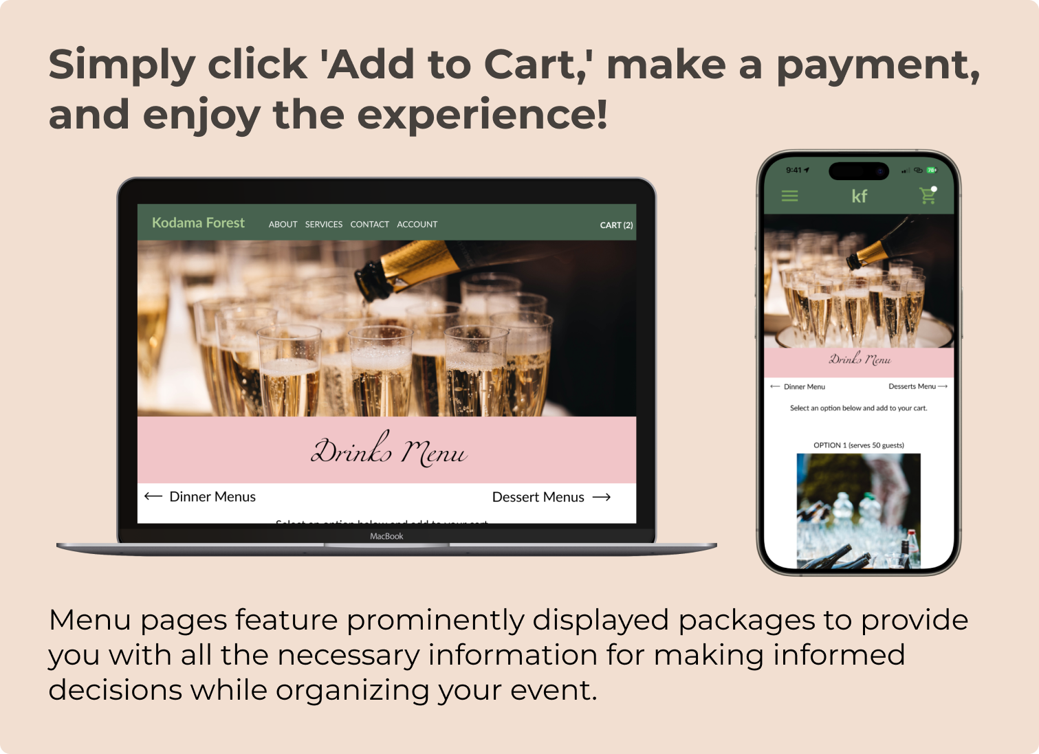
Kodama Forest

A responsive website experience that allows users to select from pre-made menus and build their own catering menu for any event.
Overview
My Role
Managed end-to-end product design cycle, commencing with ideation and conducting research interviews to create a final interactive prototype through various iterations incorporating peers’ feedbacks.
Tools
Figma, Mural, Google Slides, Adobe Acrobat, Pen and Paper
Timeline
September - December 2023
Process

Problem
Planning for an event can be time-consuming, especially when it comes to deciding what food to serve guests.
Solution
Create a platform where event planners can build their own menu from a pre-set menu provided by the venue. This would save the event planners time and energy.


Empathize
User Interviews
A primary group identified through research included newly engaged individuals who were feeling overwhelmed by the wedding planning process.
During the ideation phase of the project, user interviews were conducted to build a new persona and inform the design.
Four users were remotely interviewed and I asked questions like:
When planning an event, would you prefer to create a menu or select from one already made?
How do you feel about having to choose your own vendor for your event?
How important is it to you that the pricing of items be listed on catering websites?
three main pain points
-
01. planning
Planning an event can be stressful, and thinking about what to serve guests can certainly add to this stress.
-
02. vendor research takes too long
Doing in-depth research on vendors can be time-consuming.
-
03. lack of transparency
Prices of menu items are usually not disclosed or displayed on menus which can be frustrating when trying to stay within a budget.
User Persona
After gathering information from user interviews, persona Gem was born to address the three main pain points.

Journey Map

Define
Problem Statement
Gem is a busy college professor who needs a quick way to put together a menu for her friend’s surprise birthday party because crafting one on her own takes too much time.
Hypothesis Statement
If Gem visits the Kodama Forest catering website or app, then she will be able to quickly browse the pre-made menus and find one that is within her budget for her friend’s surprise birthday party.
Ideate
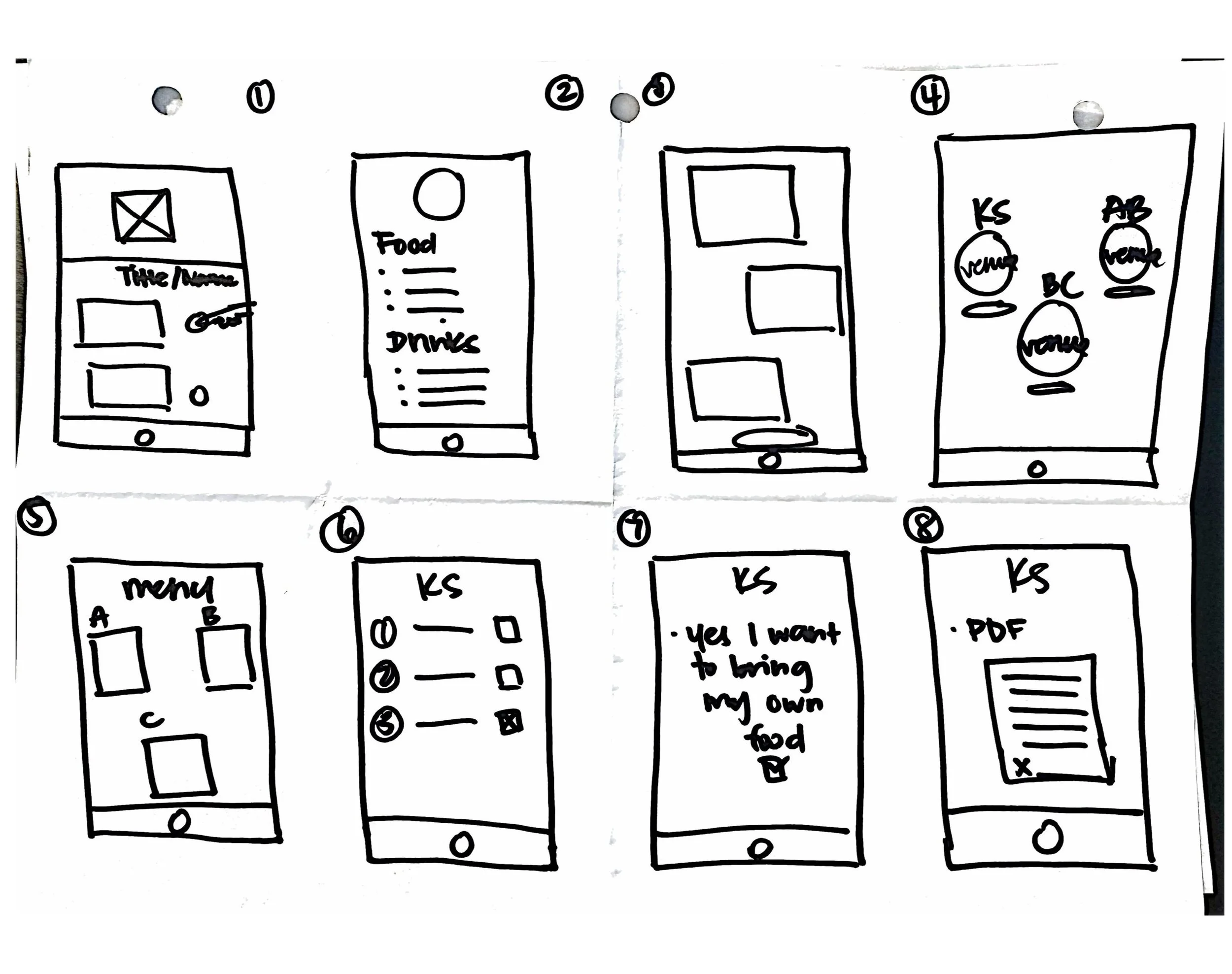
Sketches
Crazy 8s
Sitemap
Competitive Audit
To shape the design, I conducted a competitive audit amongst four key competitors.
My goals:
Compare the in-app/online ordering process
Observe pros and cons
Identify gaps and areas of opportunity
I discovered that there were many areas of opportunity that my app could address.
Four key competitors:
EzCater
The Knot
WeddingWire
Foxtrot
-
PROS
ability to create an account
detailed list of ingredients
consistent branding
-
CONS
unclickable elements
catering prices not shown
requires account to purchase
-
OPPORTUNITIES
add modal frames to prevent users from accidentally closing windows
include alt-text for images
include images of food served
add typeface-size adjuster
ensure items are clickable
add pricing for packages offered
-
GAPS
lack of accessibility features
inconsistency across devices
animations slow down page load times
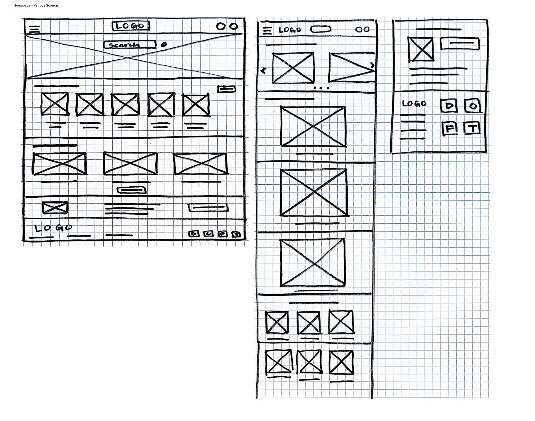
Design - Low-Fidelity
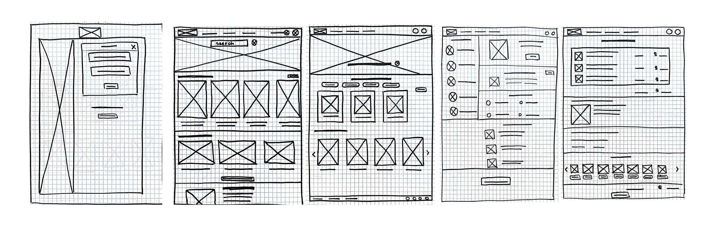
Paper Wireframes
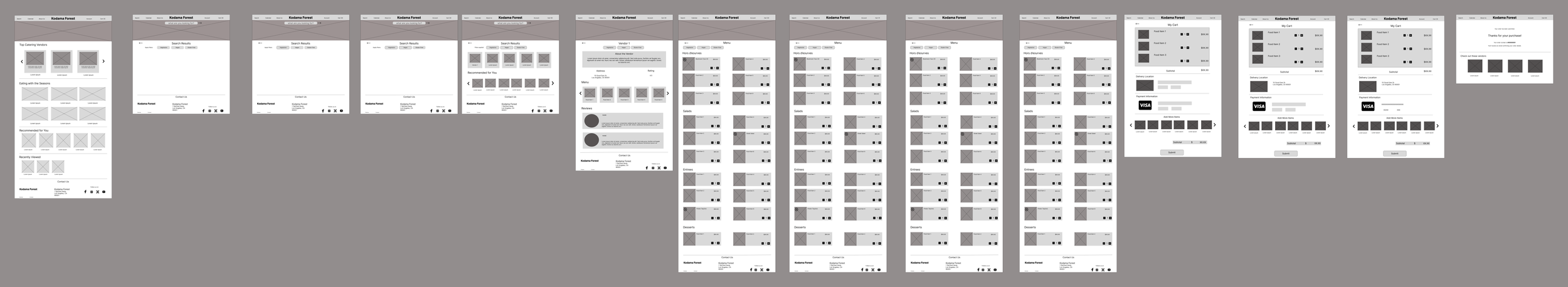
Digital Wireframes
Version 1:
I drafted iterations of each screen on paper.
I also knew that users would accessing the site from various devices so I began designing wireframes to ensure the site would be fully responsive.
Version 1:
I ran a usability test to determine if the functionality and user flow made sense to testers.
After gathering results from the initial usability test, I re-designed all screens to follow a more simplified layout that addressed users’ needs.


Test
Lo-Fi Prototype
Usability Testing
Affinity Mapping
Gathering Insights
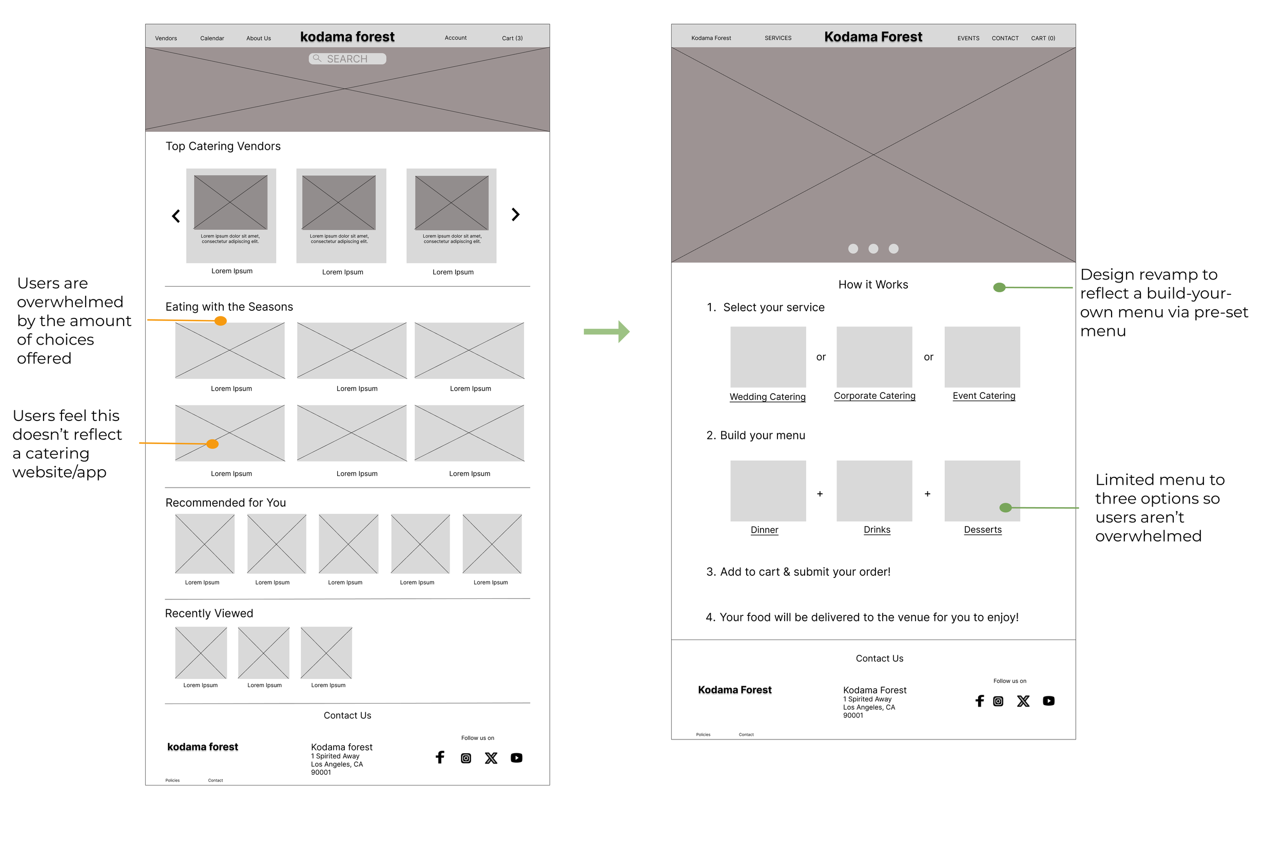
After conducting the usability study, three findings were revealed. These findings, or insights, were used to inform new designs.Findings revealed there were three key insights:
01.
Problem: Users are confused about the purpose of the website.
Improvement: Address the user need for a way to build a menu quickly and efficiently, without feeling like a food-ordering website.
02.
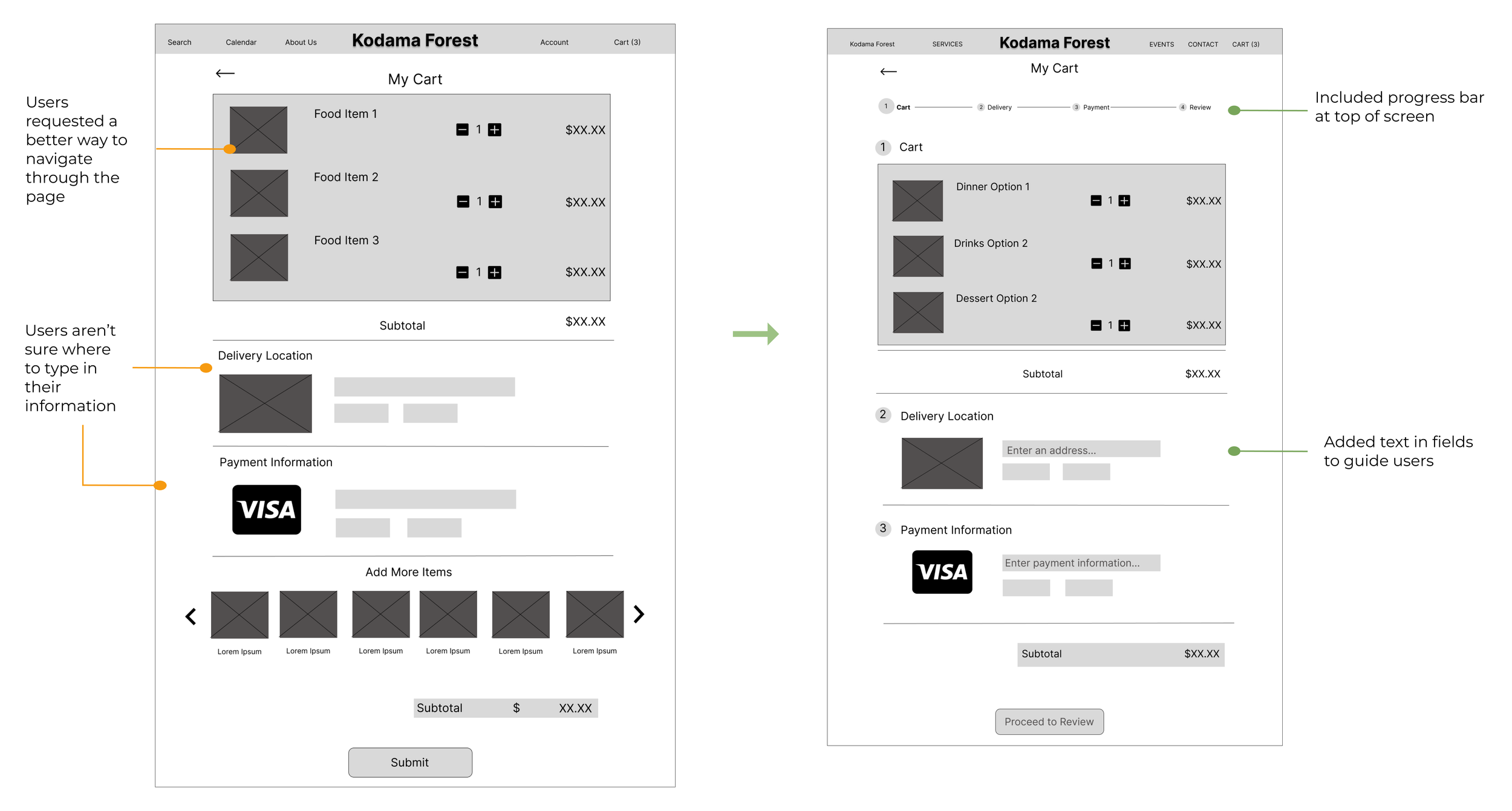
Problem: Users are unable to navigate through the checkout process.
Improvement: Add progress bar on checkout page that users can follow along with.
03.
Problem: Menu items feel unintuitive for wedding catering and should include drinks and desserts.
Improvement: Add drinks and desserts to the menu to make it feel more familiar to users.
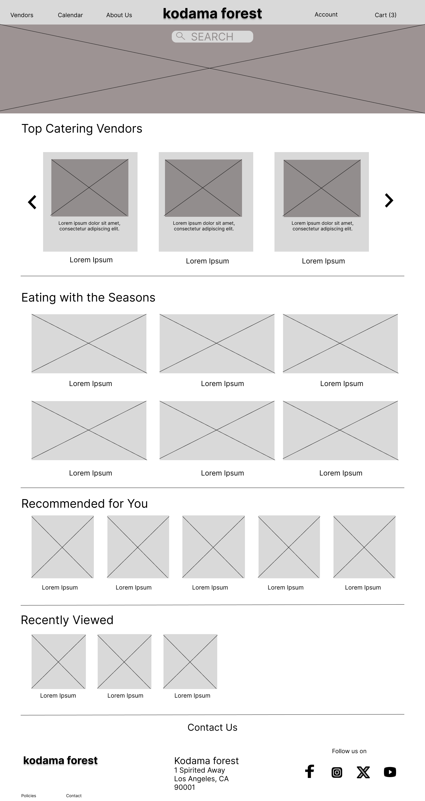
01. lo-fi iteration of home screen
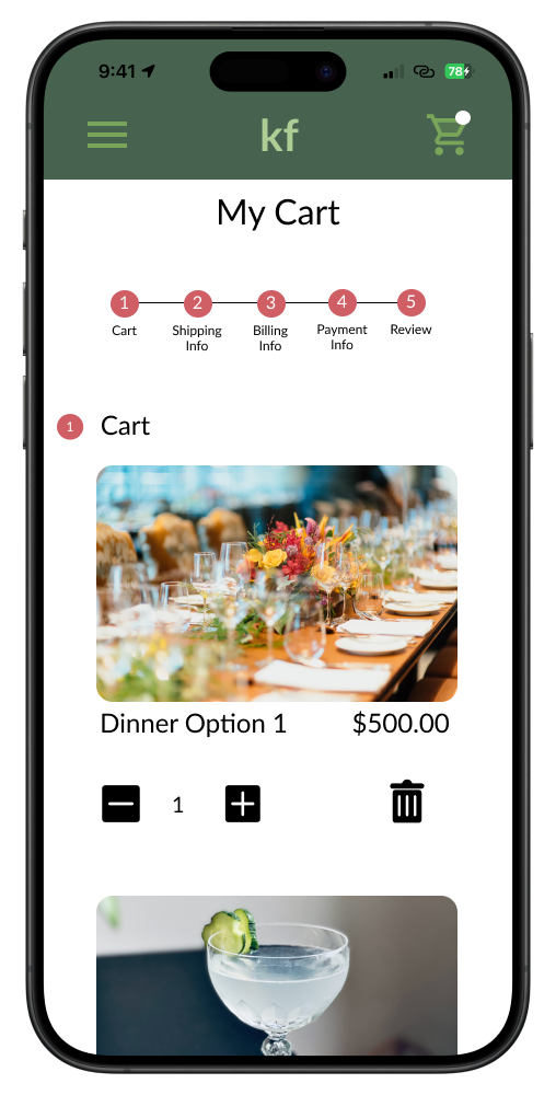
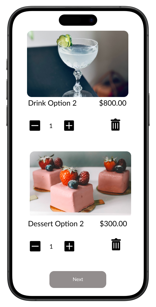
02. lo-fi iteration of cart screen
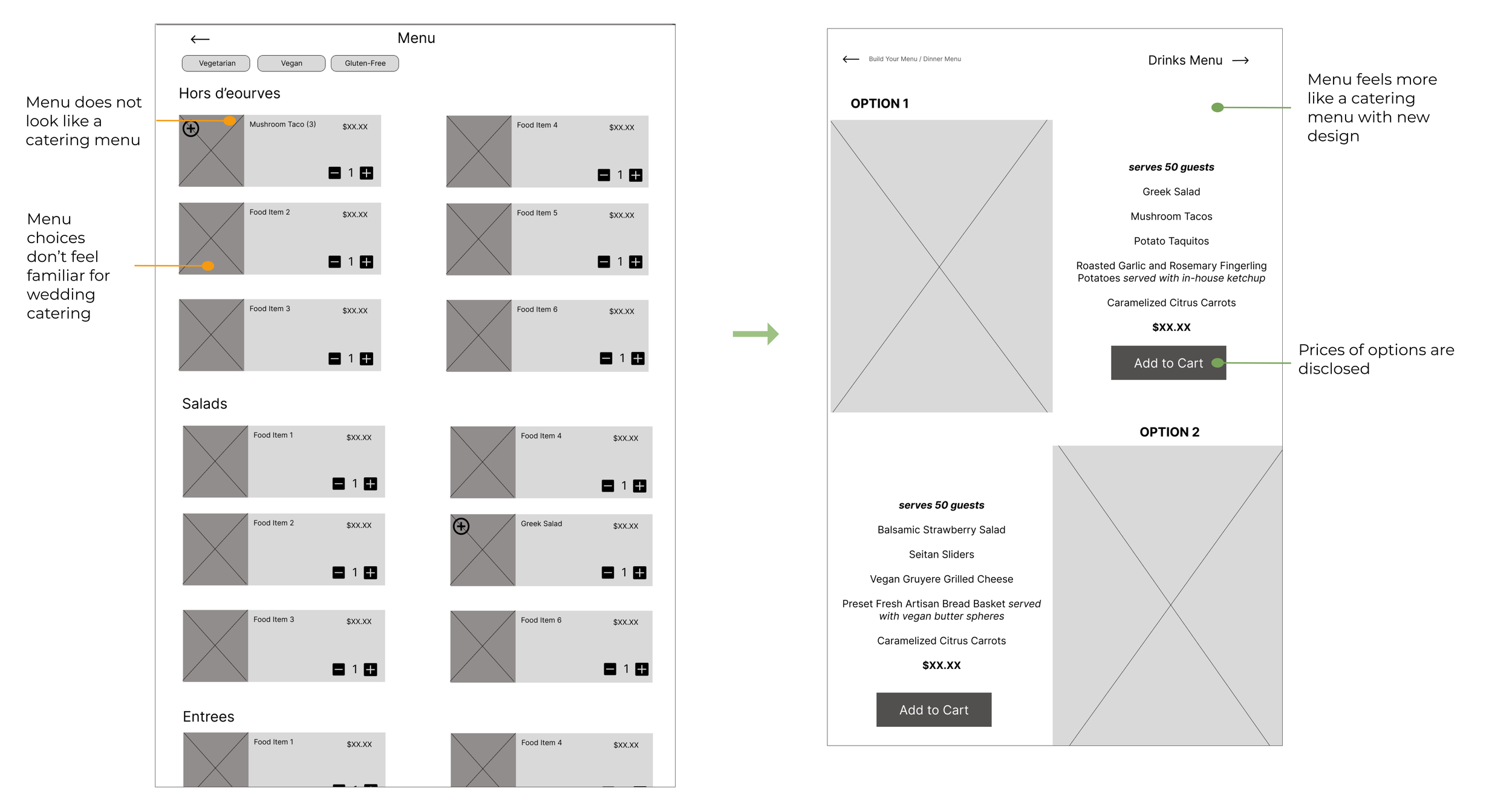
03. lo-fi iteration of menu screen
Design - High-Fidelity
Digital Wireframes
Mockups
After incorporating feedback from the lo-fi prototype, I ran another unmoderated usability test with 5 participants to determine if the pain points had been addressed and/or if other pain points had arisen.
Test
Hi-Fi Prototype
Usability Testing
Affinity Mapping
Gathering Insights
I conducted an unmoderated usability study with 5 participants to determine if there were any pain points with the hi-fi prototype. Testing revealed three new insights:
01.
Problem: Users are frustrated by elements that appear interactive, but are not.
Improvement: Remove underline on menu screens so text is not interactive.
02.
Problem: Users are having difficulty reading text on some screens due typeface color being too light and size being too small.
Improvement: Update typeface color from gray to black against white backgrounds and increase body text size to improve readability.
03.
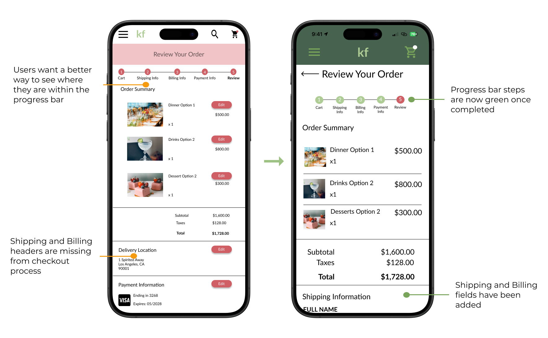
Problem: Users are frustrated by the checkout screen due to unintuitive layout.
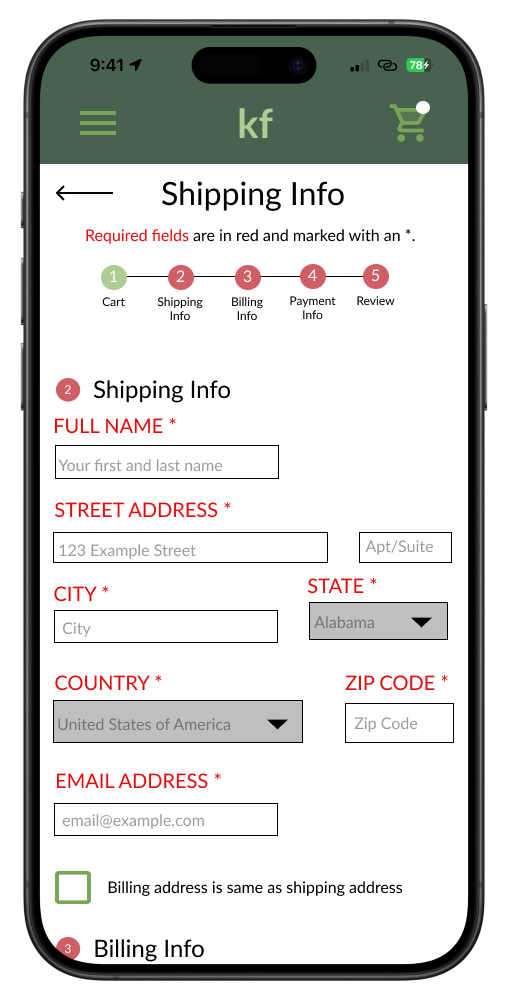
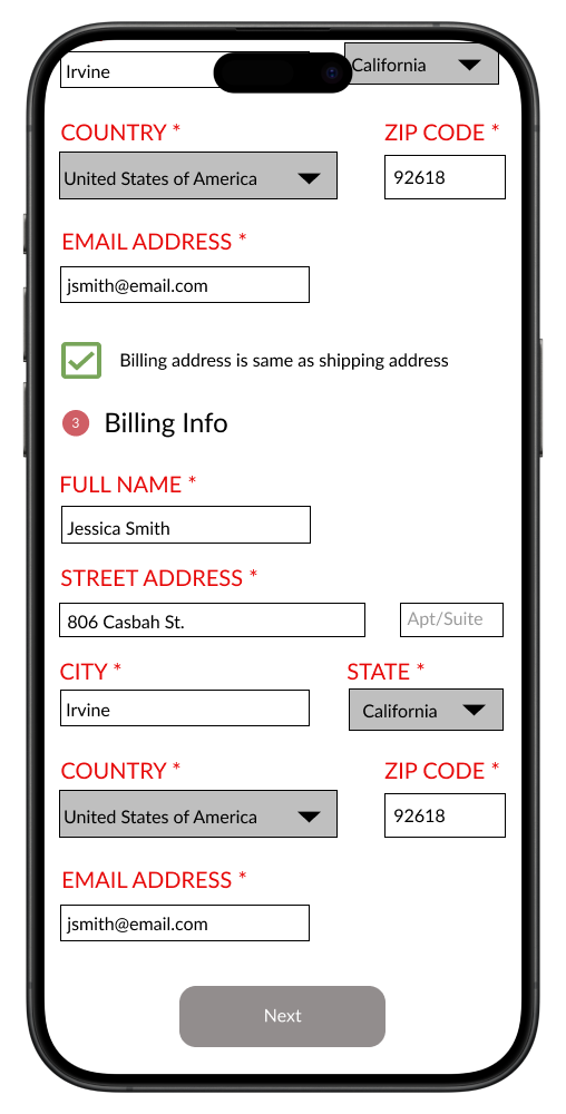
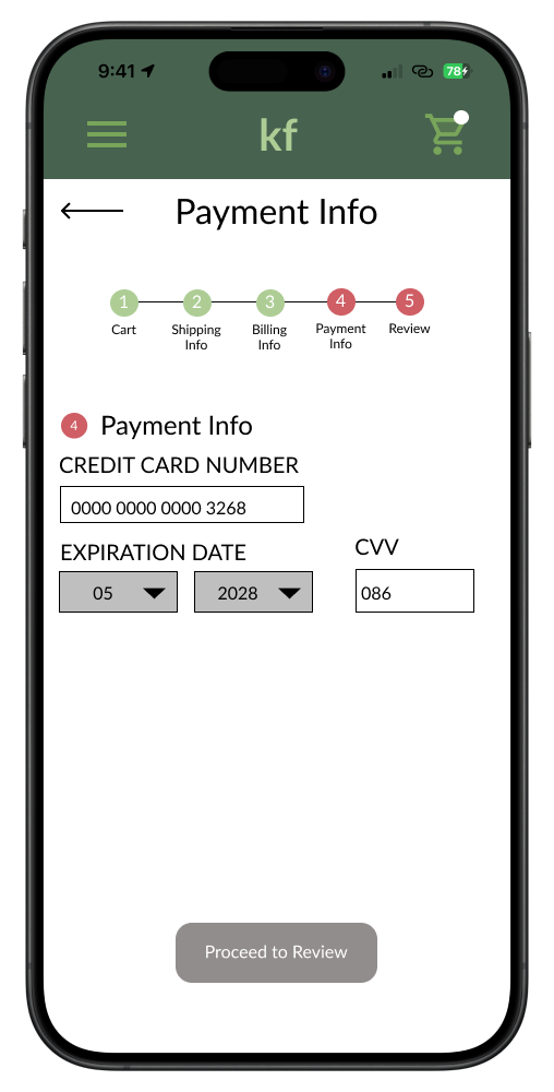
Improvement: Add progress bar colors so users know where they are within the process. Add “Shipping” and “Billing” information sections and allow for fields to be pre-populated.
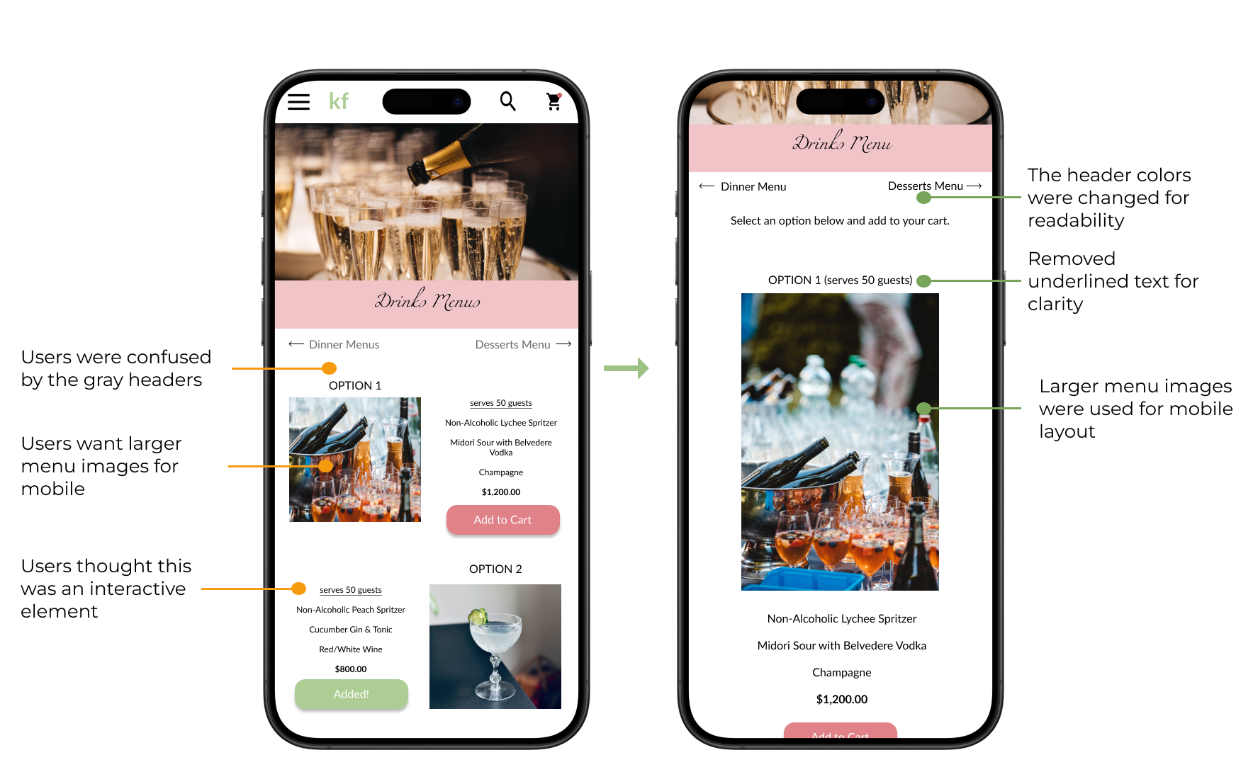
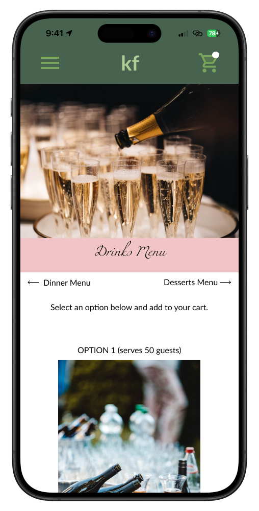
01. hi-fi iteration of drinks screen
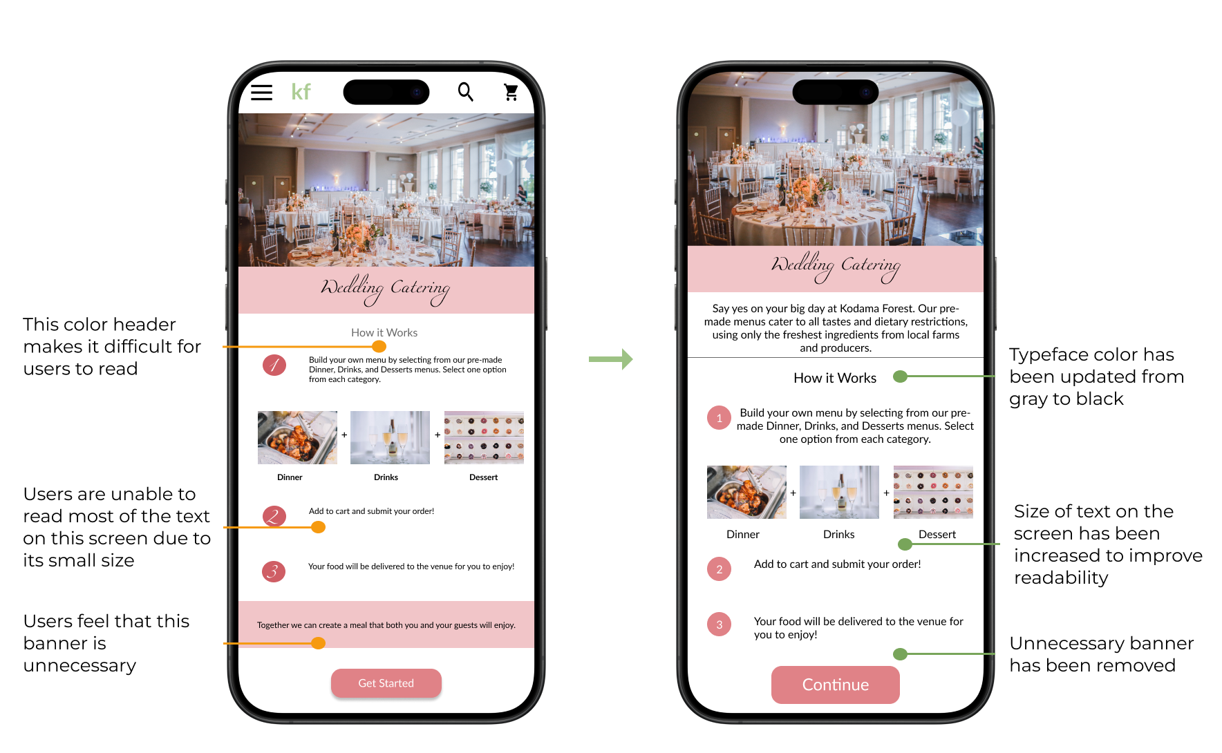
02. hi-fi iteration of wedding catering screen
03. hi-fi iteration of checkout screen
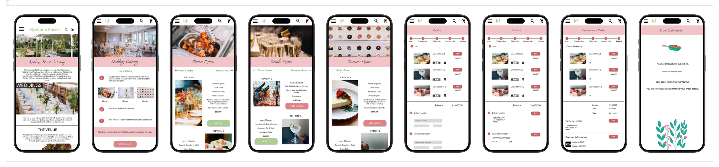
Final Designs


Design Evolution
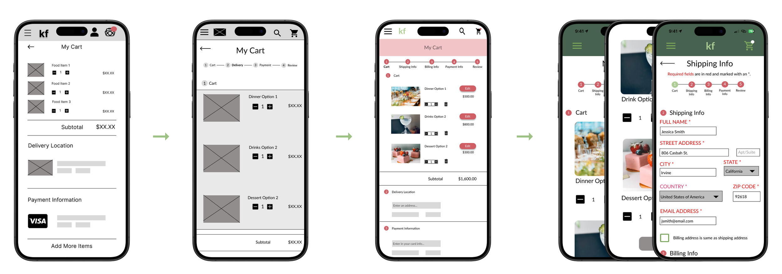
lo-fi to hi-fi evolution of checkout screen
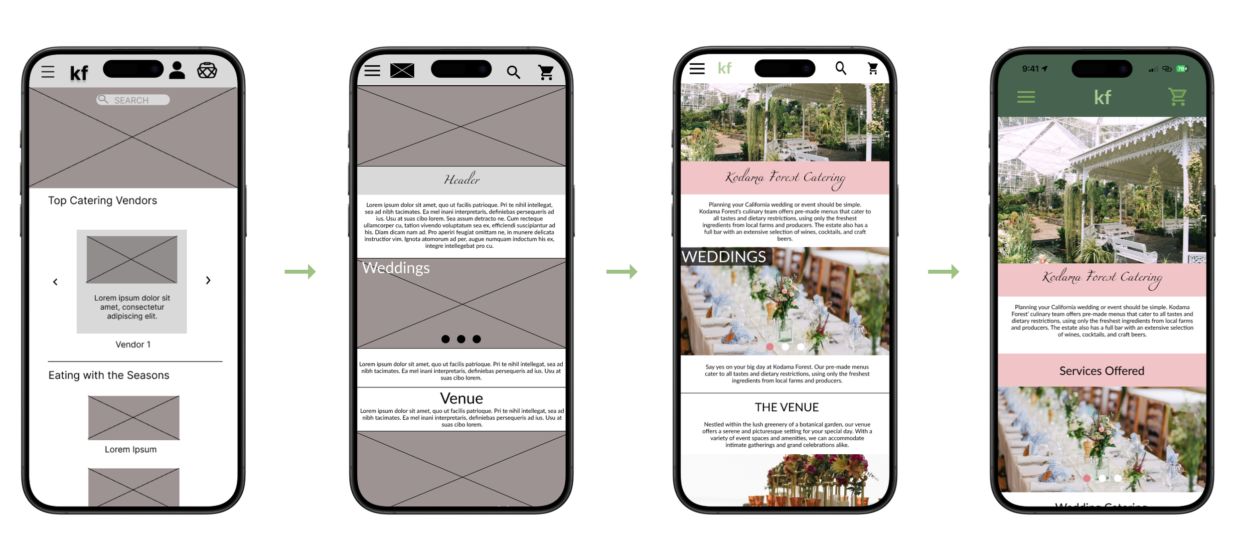
lo-fi to hi-fi evolution of home screen
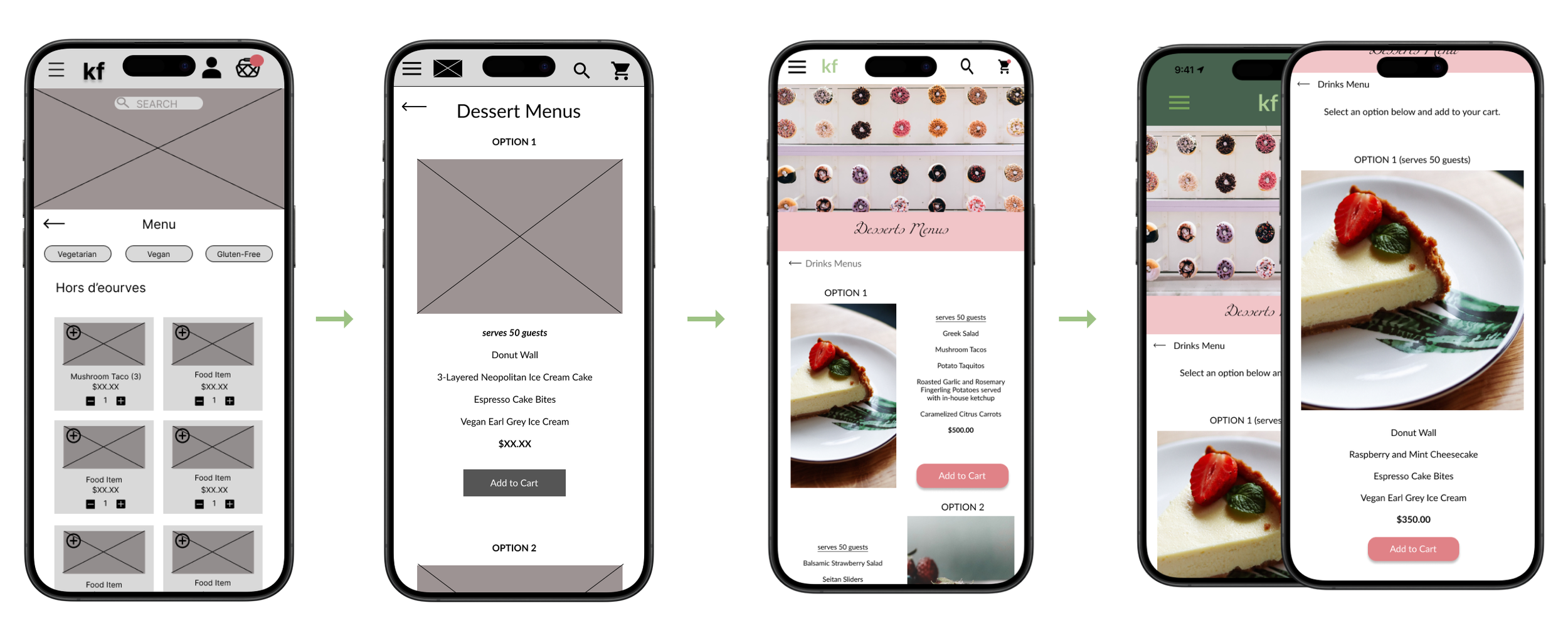
lo-fi to hi-fi evolution of menu screen
Next Steps
01.
For future iterations, I would obtain UX/UI feedback from other designers who experience in the field to improve the overall design and functionality.
02.
I would continue this project by expanding the menu to include features that allow users to plan for their event beyond catering.
03.
I would also look into enabling account creation for users so they can easily re-create the menus they’ve enjoyed in the past.
Reflections
I learned that iteration is crucial to growing as a designer. My users’ insights drove improvements in my designs; even prompting a pivot to create a more functional product. This evolution resulted in task efficiency and engagement improvements with the application.
Furthermore, I discovered that my product doesn't need to encompass everything. Time limitations prevented the inclusion of all desired features. Given more time, I would prioritize enhancements and features based on further user testing insights.